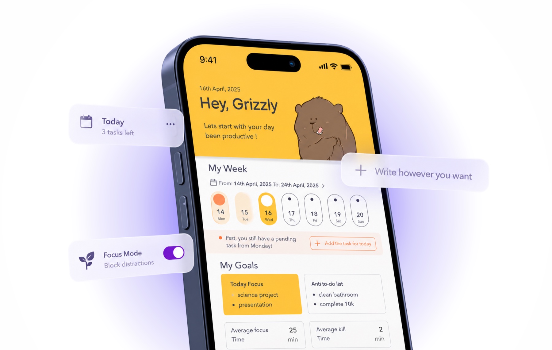
context
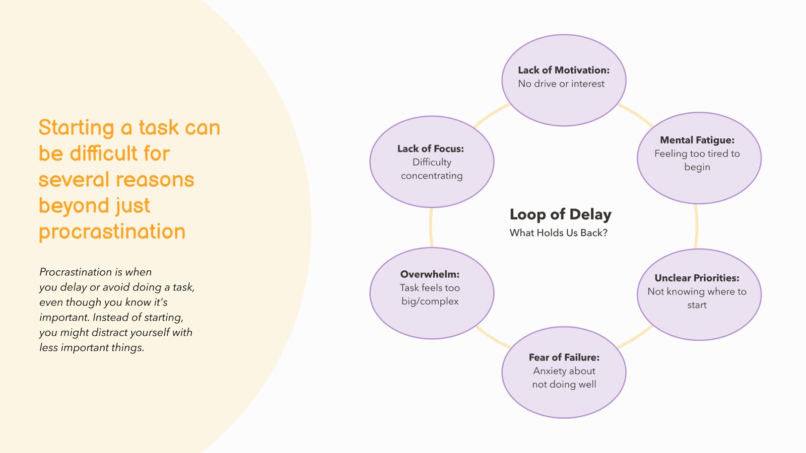
the project began with a broader question: why do people procrastinate, and what actually helps them get things done?
procrastination is really a symptom - unclear priorities, fatigue, overwhelm, fear of failure, and low motivation feed into each other, pulling people into what we called the "loop of delay." that's where the project's name comes from: loop is built to break it.
we looked at how people actually organise their time day to day - from notion and todoist to plain notebooks. a pattern emerged: the more features a tool offered, the more likely it became another thing to manage. so we focused on the working styles and behaviours underneath instead.
our approach
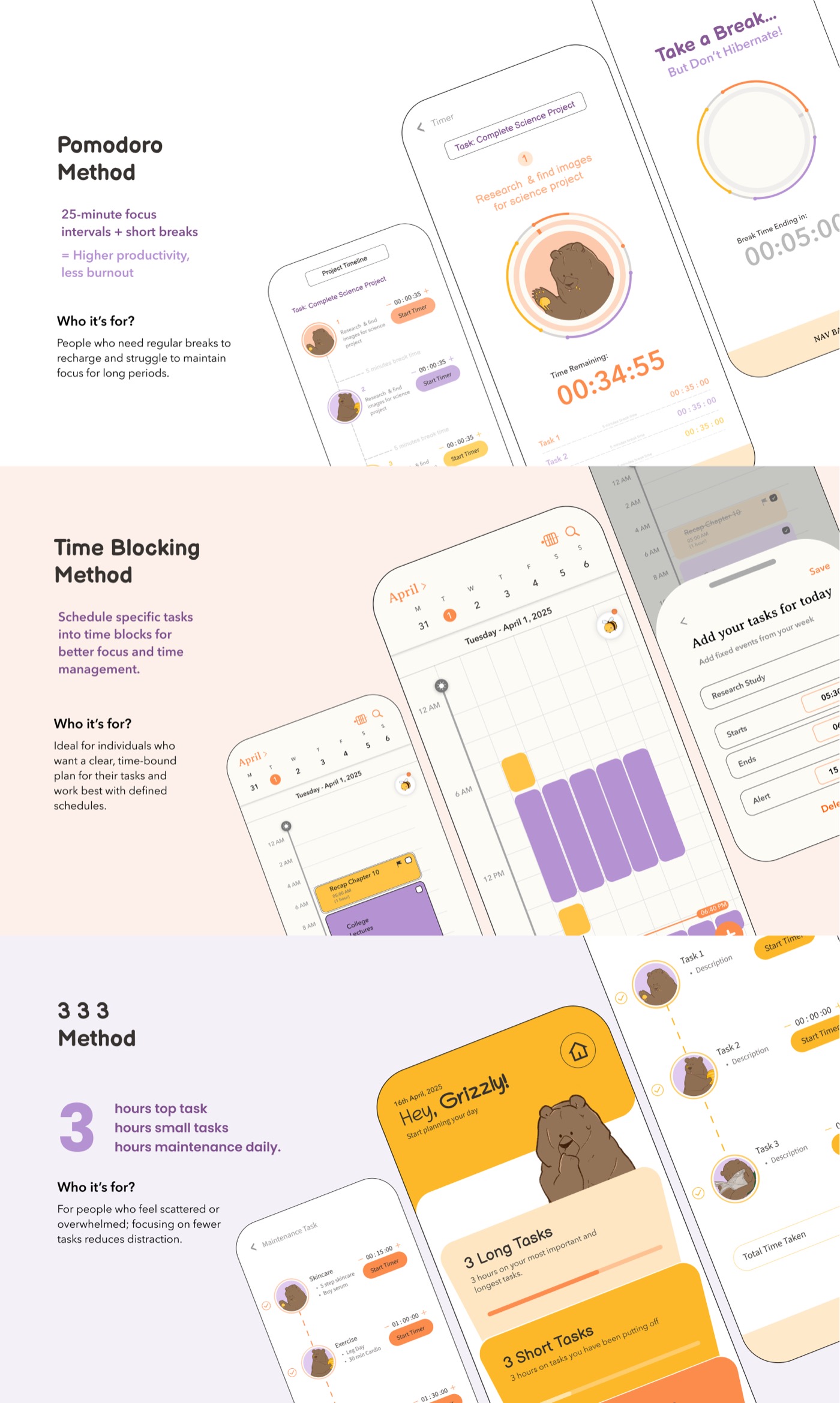
three established productivity methods kept surfacing as the logic behind how people structured their day, whether or not they knew the methods by name:
- pomodoro - working in focused 25-minute intervals, broken up by short rests, for people who need regular recharge points to sustain focus.
- time blocking - assigning specific blocks of time to specific tasks, for people who think and work best against a clear, bounded schedule.
- the 3-3-3 method - three hours on your single most important task, three hours on smaller tasks, three hours on maintenance - for people who feel scattered and do better with fewer, clearer priorities.
rather than asking users to bend their habits to fit one system, we asked whether the system could bend to the user instead.
solution
loop is a productivity app that works according to your working style, not the other way around.
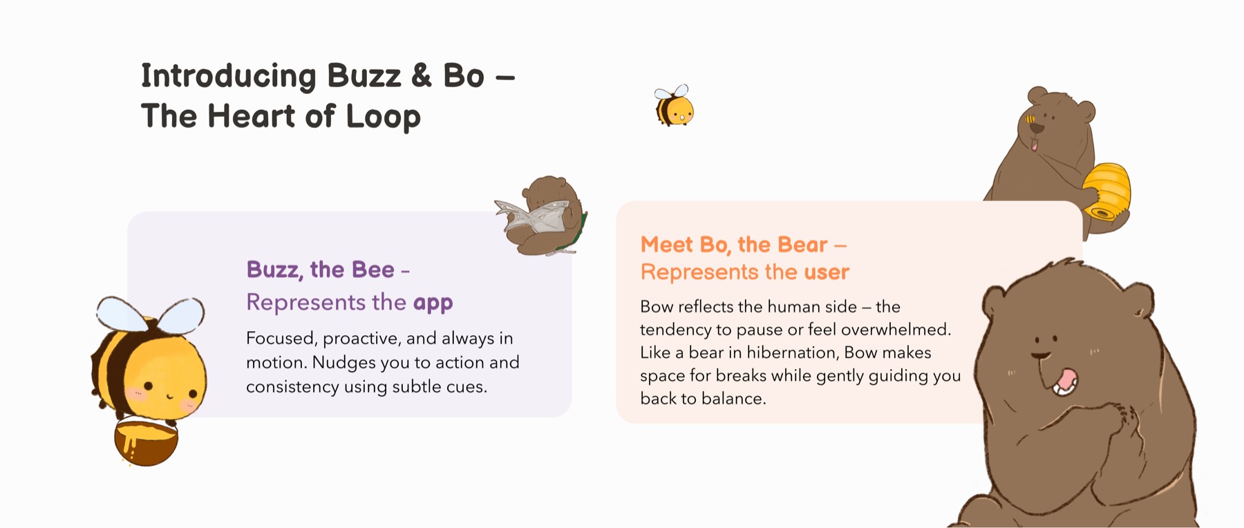
that guidance is carried by two characters: buzz, the bee, represents the app - focused, proactive, nudging the user through subtle cues. bo, the bear, represents the user - the tendency to pause or get overwhelmed, with the interface making space for that.
loop opens with a short quiz - "are you a busy bee or a chill bear?" - to get a first read on how someone naturally works.
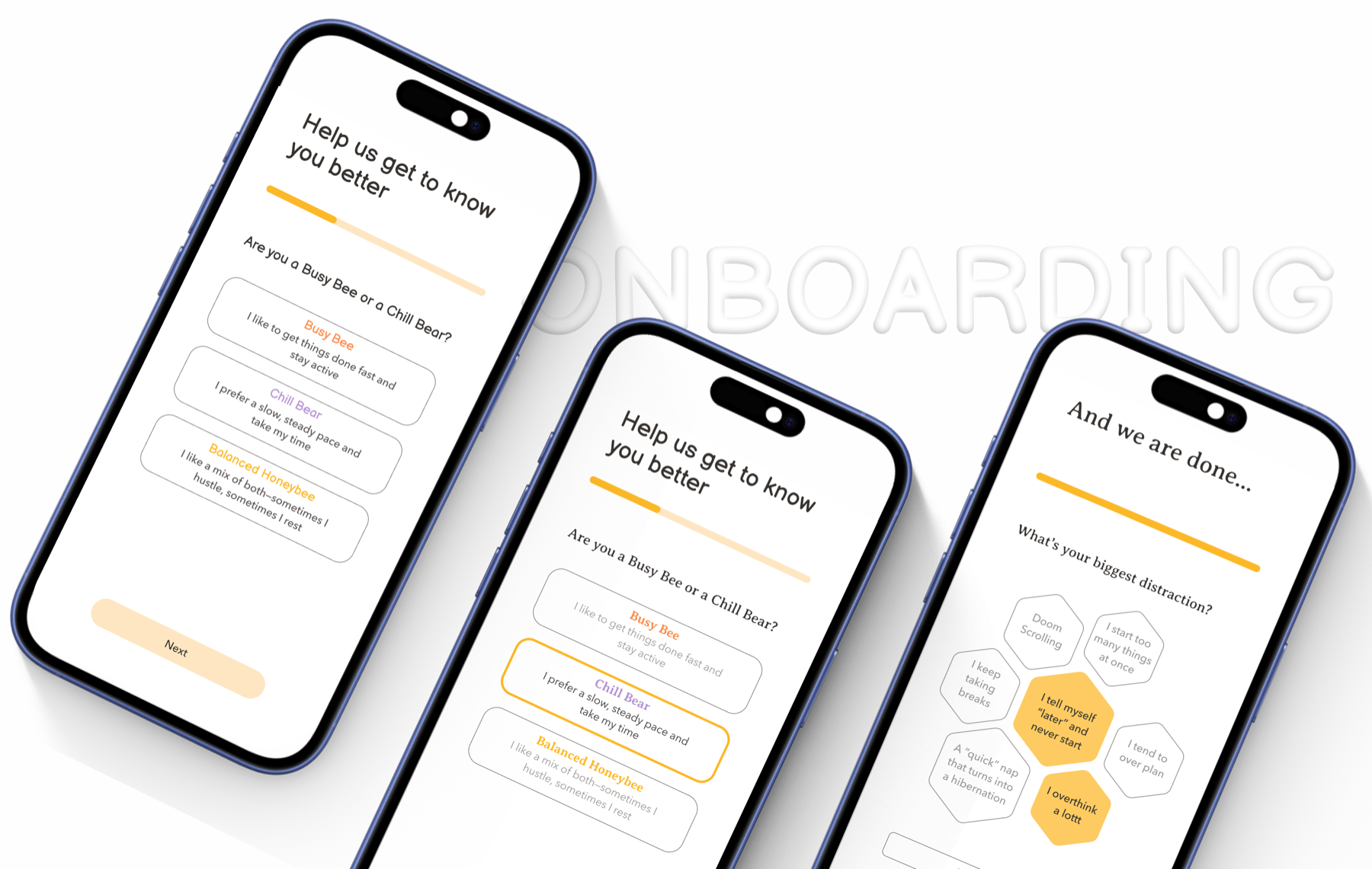
based on the answers, it recommends the method most likely to fit - pomodoro, time blocking, or 3-3-3 - then checks back in after a week to tweak the suggestion if it isn't working. users are always free to switch methods or blend them.
this plays out as a deliberate piece of choice architecture, carried by buzz and bo:
- nudge - buzz prompts with gentle reminders rather than demands, so staying on track feels effortless rather than enforced.
- budge - loop structures the choice itself, surfacing the method most likely to suit a user's habits so they start with minimal friction, while still leaving the decision in their hands.
- boost - completing tasks earns honey - small, tangible positive feedback that reinforces the behaviour and makes it more likely to repeat.
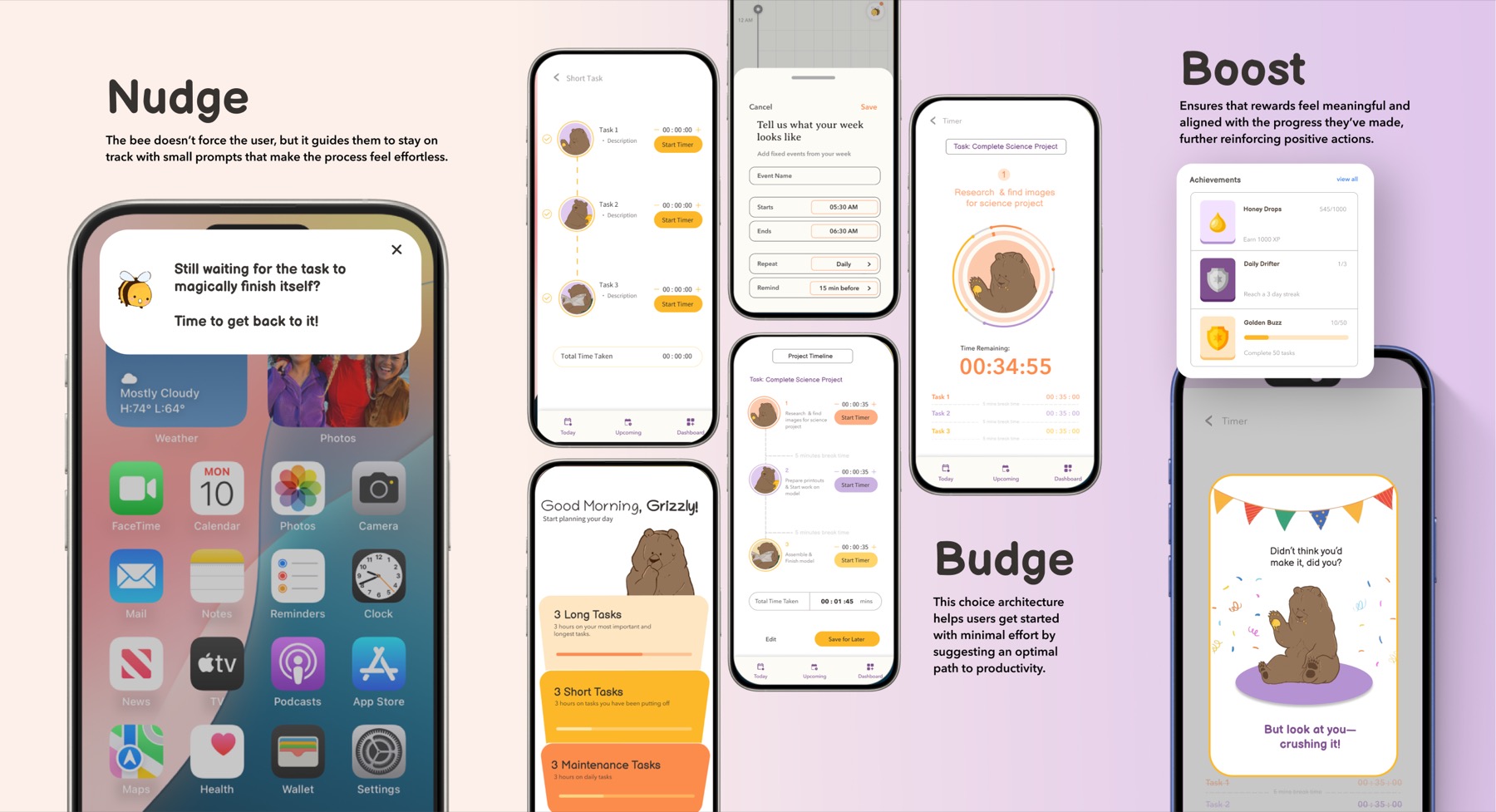
we built the narrative around buzz and bo so adopting a new productivity method would feel immersive, not like another tool to learn.
my contribution
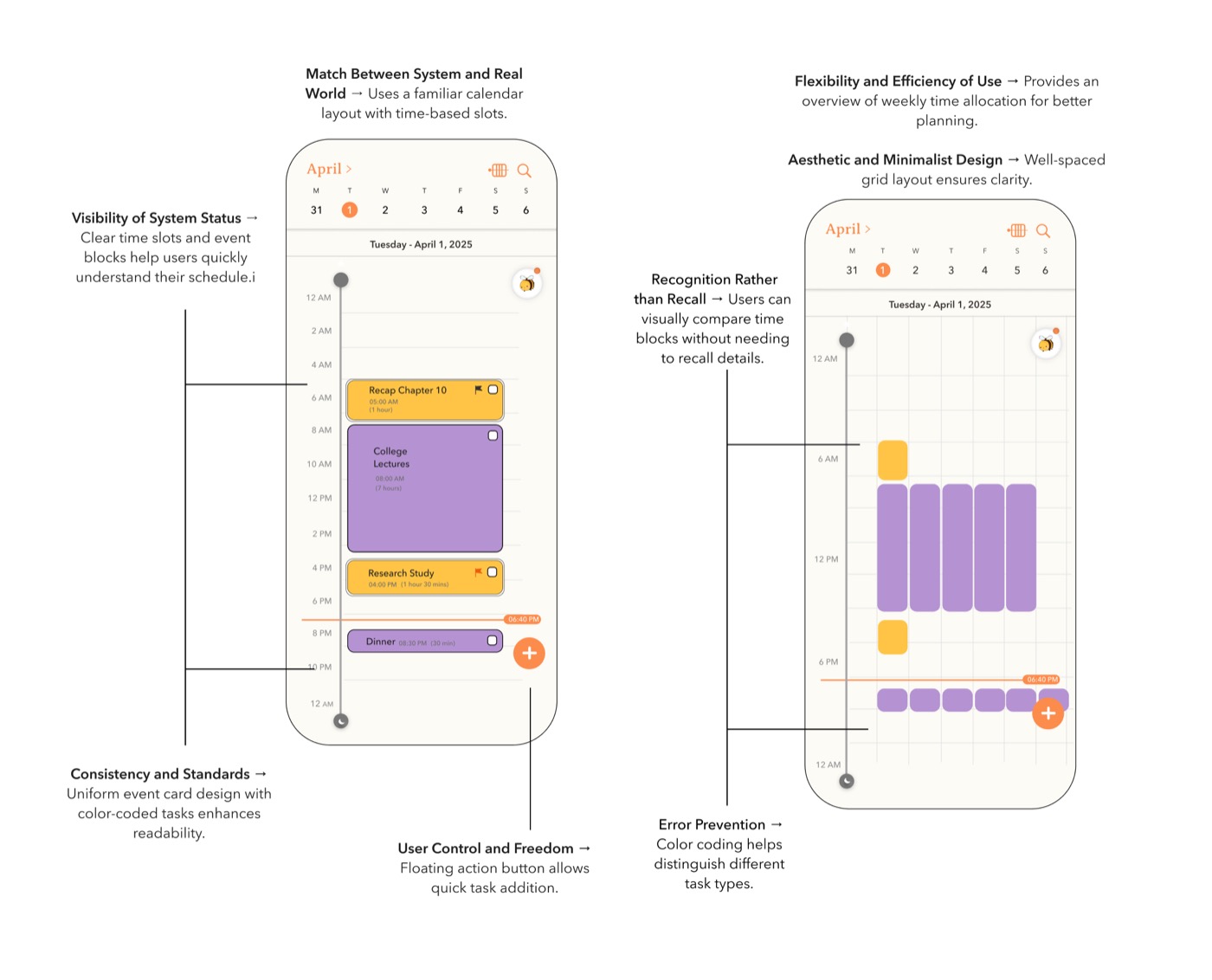
my primary contribution was the time blocking experience - called honeycomb hours in the app - designing it so a method associated with dense calendars instead felt light and legible.
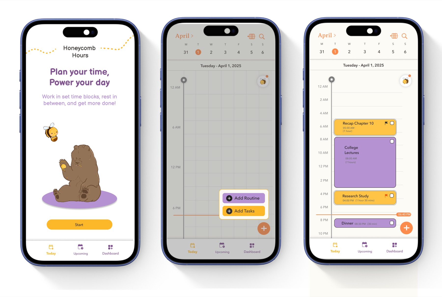
the core interaction decision was to split a user's day into two categories before any scheduling happens:
- routine - recurring, fixed commitments (classes, work, the gym) that structure the day and don't move.
- tasks - the things that actually need doing, which can be assigned a flexible amount of time.
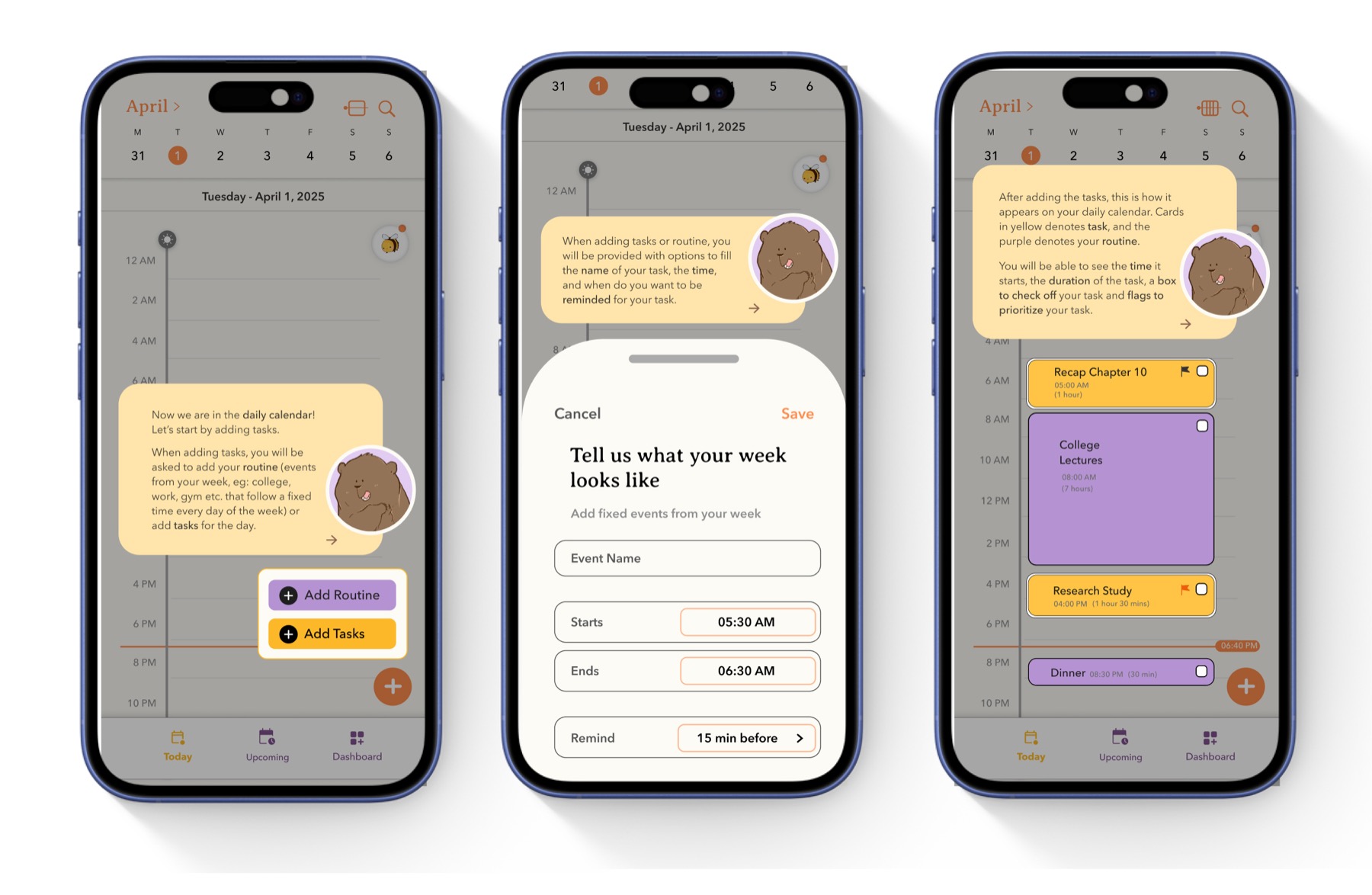
establishing routine first shows users how much of their day is already spoken for, so the remaining open space becomes visually obvious and adding tasks feels like filling gaps rather than negotiating for room. routine renders in purple, tasks in orange, and that distinction carries through the weekly overview, daily view, and every task card.
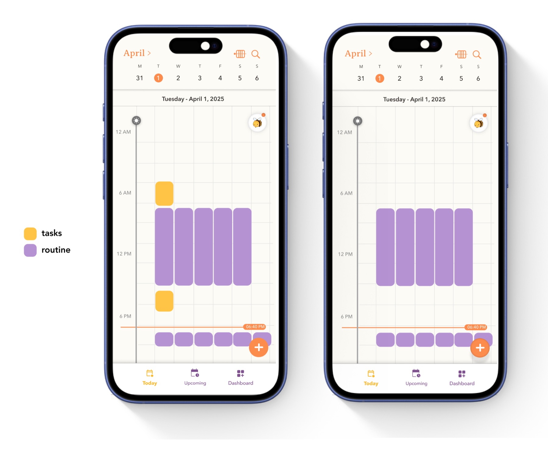
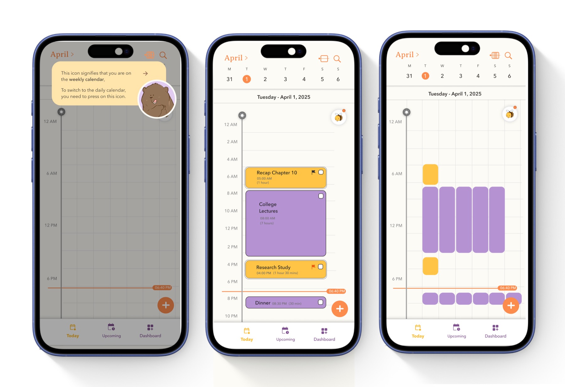
i designed a weekly view, for a macro sense of how the week is shaping up, and a daily view, for the time-slotted plan, switched with a single toggle.
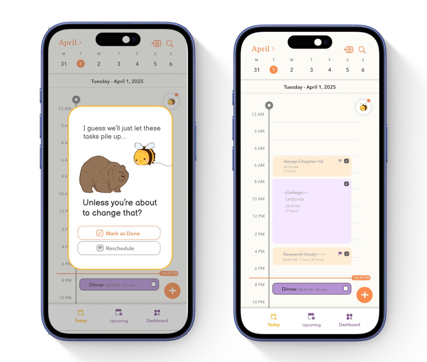
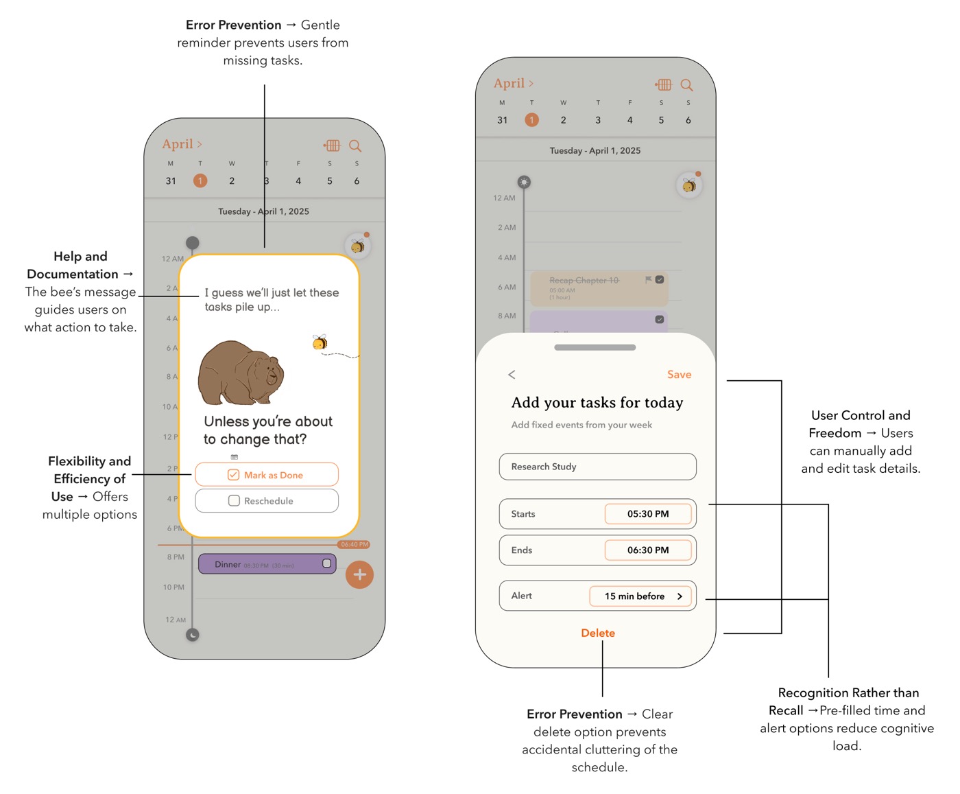
personality shows up in small moments too - an unchecked task gets a reminder in bo's voice, with the option to mark it done or reschedule. every card can be edited or deleted, with a confirmation before changes save.
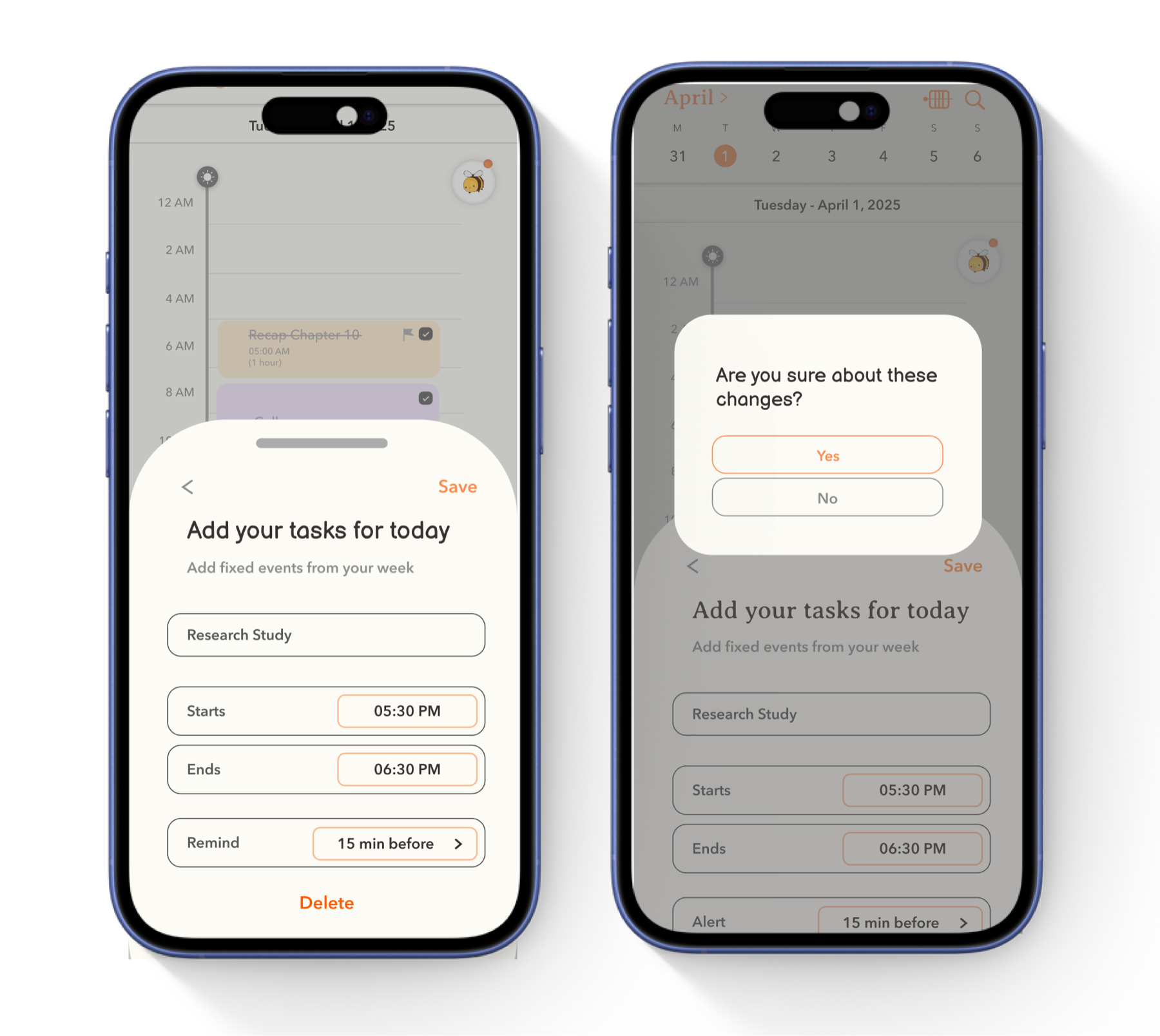
underneath the personality, the screens lean on core usability heuristics.
key learning
the biggest takeaway was learning how to turn a familiar, low-tech habit into a digital interaction without losing what made it work.
time blocking can be done with just paper and a pen. the challenge was never adding features - it was designing an interface that felt like an extension of that habit, not an addition to it.